BRANDING
Establish a new, adventurous identity
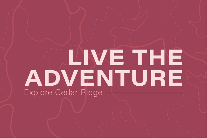
The Cedar Ridge logo was designed to visually capture the feeling of the community in a simple, recognizable way. The goal was to create something that instantly communicates place and atmosphere without feeling overly complex or decorative.
The idea behind the mark was to balance storytelling with clarity, making sure the logo could function across different applications while still feeling meaningful. Each element represents a core part of the environment and identity of Cedar Ridge, resulting in a symbol that feels grounded, welcoming, and distinctly tied to its setting.
Cedar Ridge
Scope
Year
2025-2026
Description
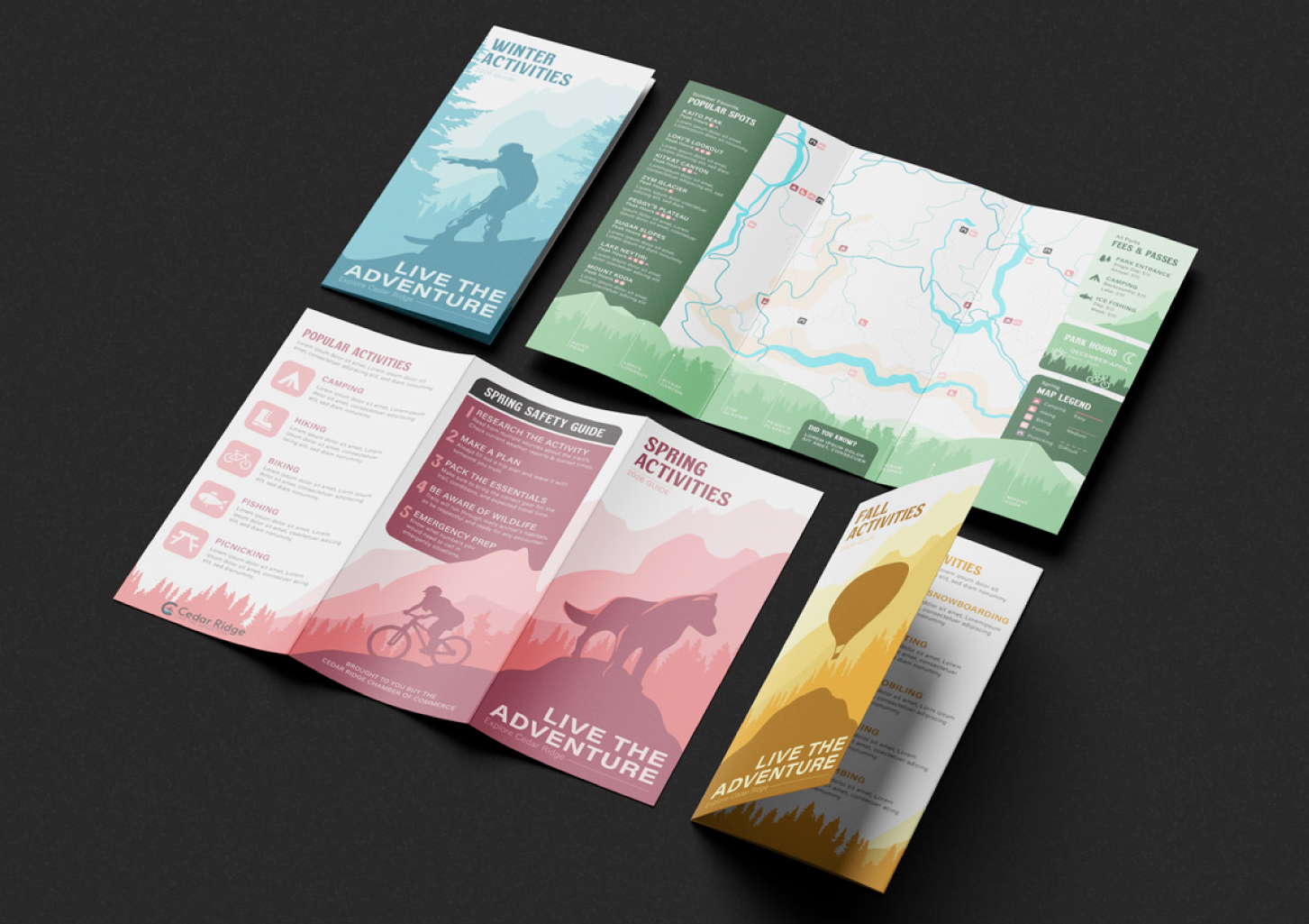
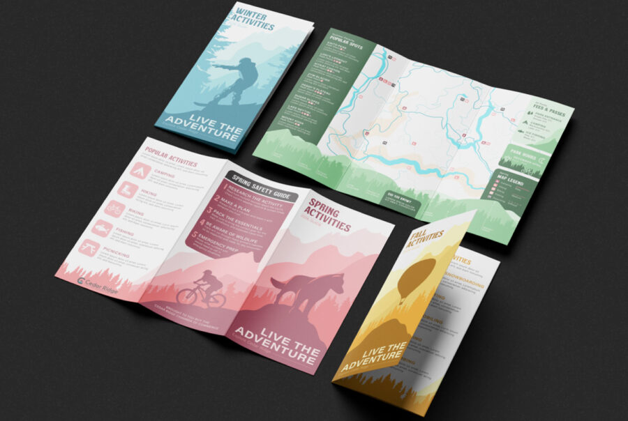
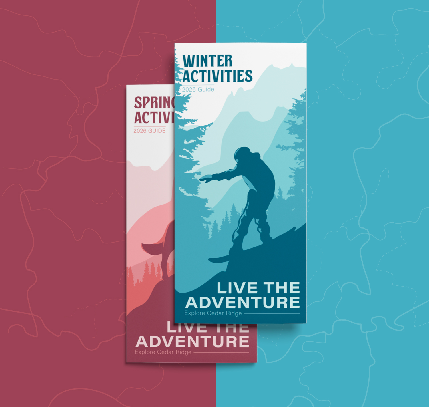
The Cedar Ridge project focused on developing a cohesive brand identity that could visually represent a welcoming, nature-inspired community across multiple touchpoints. The logo was designed as a strong central mark featuring symbolic landscape elements, establishing a recognizable foundation that informed the rest of the visual system. From there, the branding expanded into a unified color palette, typography, and graphic language that reinforced the community’s tone of warmth, clarity, and sense of place.
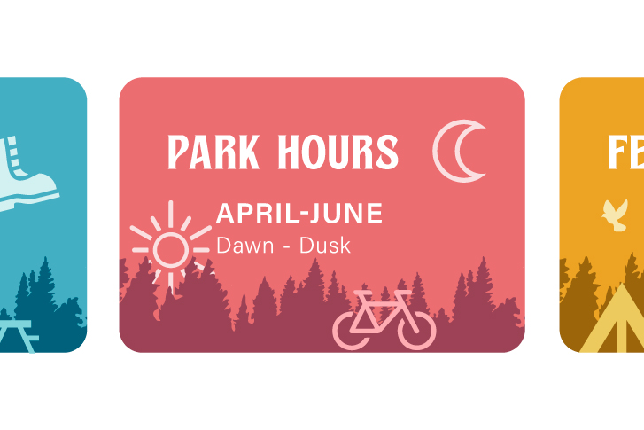
The project also included a suite of print materials designed to showcase how the identity functions in real-world applications, such as brochures, informational pieces, and promotional collateral. Each piece was created to maintain consistency with the core brand while ensuring readability, hierarchy, and visual appeal, demonstrating how the Cedar Ridge identity could scale across both branding and communication needs.
Cedar Ridge
Scope
Year
2025 – 2026
Description
The Cedar Ridge project focused on developing a cohesive brand identity that could visually represent a welcoming, nature-inspired community across multiple touchpoints. The logo was designed as a strong central mark featuring symbolic landscape elements, establishing a recognizable foundation that informed the rest of the visual system. From there, the branding expanded into a unified color palette, typography, and graphic language that reinforced the community’s tone of warmth, clarity, and sense of place.
The project also included a suite of print materials designed to showcase how the identity functions in real-world applications, such as brochures, informational pieces, and promotional collateral. Each piece was created to maintain consistency with the core brand while ensuring readability, hierarchy, and visual appeal, demonstrating how the Cedar Ridge identity could scale across both branding and communication needs.