This was a project to develop a brand and visual identity for the fictional city of Cedar Ridge. This city is where the disasters of the Emergency Operations Centre take place, and so a comprehensive visual identity needed to be developed to help improve the realism of the world within the simulator.
An FFF Studios Project
Cedar Ridge
Scope
Branding
Logo
Print
Icon
Team
Janelle Hinesley – Graphic Designer
Year
2025 – 2026
CONCEPT
Establish a new, adventurous identity
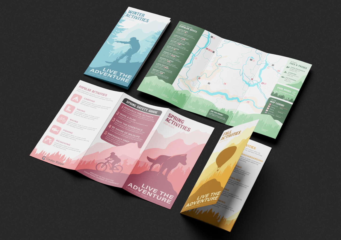
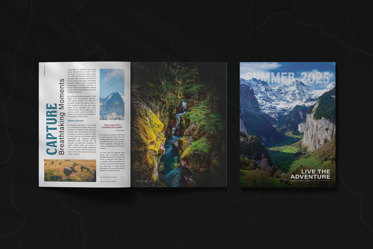
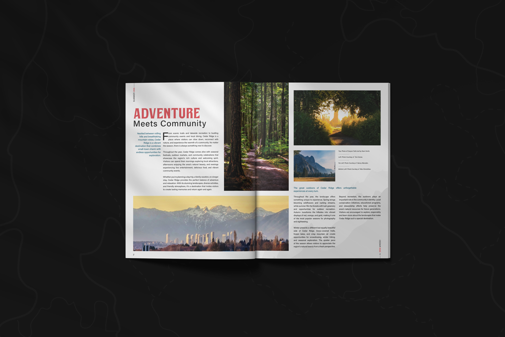
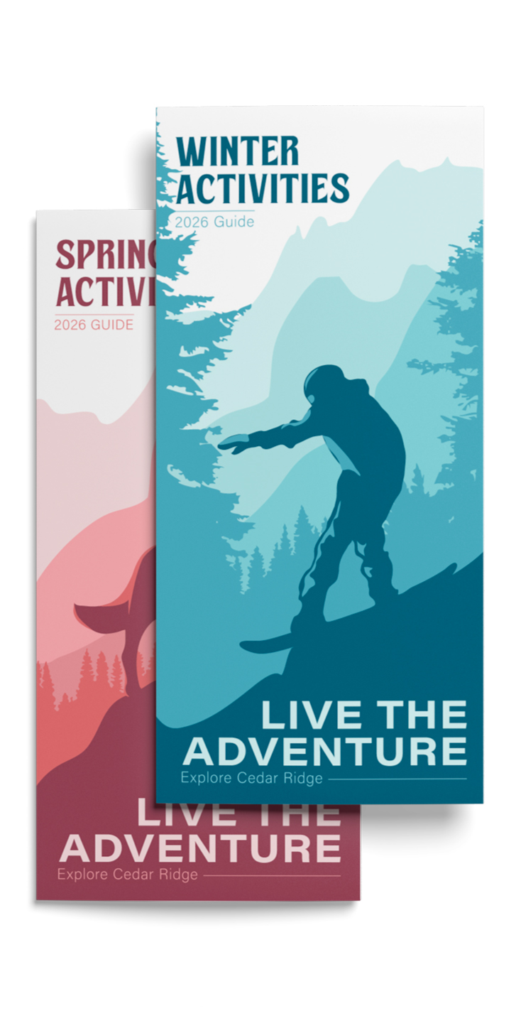
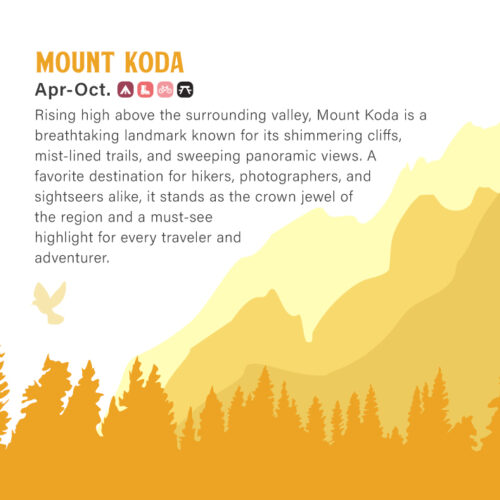
The Cedar Ridge project focused on developing a cohesive brand identity that could visually represent a welcoming, nature-inspired community across multiple touchpoints. The logo was designed as a strong central mark featuring symbolic landscape elements, establishing a recognizable foundation that informed the rest of the visual system. From there, the branding expanded into a unified color palette, typography, and graphic language that would reinforce the idea of warmth, clarity, and sense of place.
The project also included a suite of print materials designed to showcase how the identity functions in real-world applications, such as brochures, informational pieces, and promotional collateral. Each piece was created to maintain consistency with the core brand while ensuring readability, hierarchy, and visual appeal, demonstrating how the Cedar Ridge identity could scale across both branding and communication needs.